architecture

Week 45

IMG_1279 2

 
On Thursday, my Dad and I headed to London, to go to a private viewing of the International Garden Photographer of the Year at Kew Gardens. It turned out I had won the young category with this image which I was incredibly happy with as I had never won a photography award before.

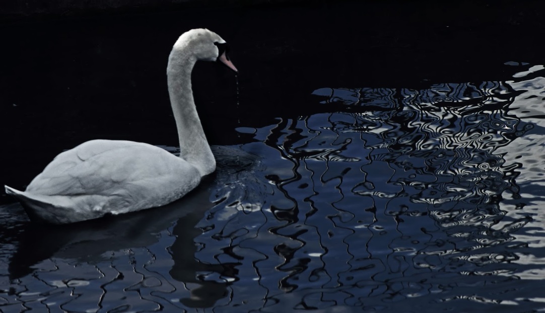
After having gone to the exhibition, I quickly went around Kew Gardens, looking for any photo opportunities as the sun was out. While walking around one of the lakes, I noticed this interesting reflection I wanted to document. I waited for a subject and luckily a swan came into the frame. After it had dipped its head in the water, I took the photograph, capturing the water dripping out the beak. I am quite pleased with the pose, however I was hoping to get a more abstract look which was less cliched.

In Photoshop, I reduced Highlights as the swan was overexposed. Through color balance, I increased blues to reduce the unattractive, green tinge to the water.

I was influenced by my favourite wildlife photographer Paul Nicklen who takes his shots in the vicinity of Water. He first came to my attention when he won the Wildlife Photographer of the Year.

IMG_1320 2

This second image was also taken in Kew Gardens in the Palm House greenhouse where there were lots of unusual plant.

While walking around, I spotted this plant with distinctive lines and began photographing it. I set the aperture to f/14 to get as much in focus a possible so I could later crop it in Photoshop and I took the image from above to get different layers and an more of an aerial perspective.

When I got the photo onto the computer, I tried lots of different cropping formats so I could make the most of the lines and layers. Although it doesn’t really have much of a composition, I went with this as it was the most pleasing to look at. I then converted the image into black and white and boosted the contrast, while trying to retain some of the detail in the leaves.

I was influenced by this image by Robynne Limoges which was at the IGPOTY exhibition. I really liked the graphic quality in the image which I have tried to create in my photo.

IMG_1385IMG_1388


These final images are a lot different from most of my images, but I have decided to include them anyway.

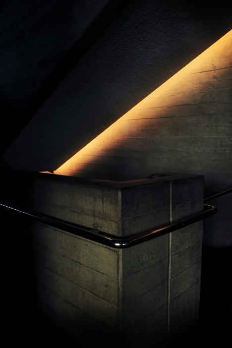
They were taken while in the Royal National Theatre and they are both of the very industrial staircase, which I was drawn to by the interesting light. As it was quite dark in there, I had to use a wide aperture which meant not everything was in focus. I composed the photographs using lots of diagonals to create more abstract photographs, especially with the one on the left.

In Photoshop, I played around with the tone curve adjustment, making both the photos slightly underexposed, which in this case I believe is better. In the left photo, I increased blues and reds and in the photo on the right I increased blues and green. Overall I am pleased with the results, but f I were to take the images again, I would have tried to retain some of the details in the darker areas.

I was influenced by the architectural photographer Hélène Binet for her artistic photographs where she has focused particularly on line and shape.

Barney

Week 40 – Car Top Reflection

Week 40


As week 40 is slowly coming to an end, here is my photograph of the cooling towers in Ratcliffe-on-Soar.

Before my Dad and I went out to take photographs, I looked on Google Earth to gather an understanding of the best angles to take photos of the cooling towers from . After a while, I found a spot where the setting sun would be behind the cooling towers, however, when we got there the sun was too bright and the view was slightly obstructed by some trees. In a desperate attempt to get a clear view of the towers lit by the setting sun, we drove closer and parked by the railway station right next to it. I wanted to get a unique image of the power station, so I placed my camera on the top of my car and managed to get the reflection just as the sun was setting. I composed the photograph with the reflection dividing the photo in half to give it a symmetrical look. Also, I  tried photographing it with my Dad walking across, but it lost the dramatic feeling I was after. Once the image was on the computer, I increased the contrast, sharpness and brightness and I added a few filters to get the colour I was after.

Overall, I am really pleased with the image and I would say it is one of my favourite photos I have ever taken. Originally, I wanted the light to be a bit stronger, however looking at it now, I prefer the fact that it is slightly diffused and softer.

Although my image is not in black and white, I was influenced greatly by Michael Kenna’s stunning Power Stations series where he photographed power stations around England, including the one in Ratcliffe-on-Soar.

Barney

Week 35- Diagononals

IMG_7952


As I am now on the 35th week of the competition, here is my photo, taken near the Nottingham Contemporary in town.


I planned lots of different photos over the weekend and all together I went out three times in total but none of the photographs went to plan. This photograph was in fact taken in a hurry on Sunday. I had seen that the weather was going to be good on Sunday, so I headed out at three o’clock, but I hadn’t realised how early it became dark, so by about ten minutes of being in town it had become dark. I took this photo going up to the Nottingham Contemporary, as I liked the different lines and diagonals. I framed the image with a large depth of field and I got my Dad to walk up the steps and as he went into the furthest third I clicked the shutter. When I got the image onto Zoombrowser ( the editing software I use) I cropped the image to get rid of some distractions. I then converted it into black and white and increased the brightness and the contrast . After that, I increased the sharpness two times, to add a deliberate grain to it. This gave a gritty, atmospheric effect like photos taken in the mid-twentieth century when colour film had not been invented and film produced grainy images.


Overall, I am pleased with the large depth of field, the effect and the use of diagonal lines. The one thing I am annoyed about, however, is that my Dads face is not quite in focus.


For this photo, I was influenced by the work of Henri Cartier Bresson, who is possibly the most famous street photographer. It is remarkable that in the mid-twentieth century he was able to capture images which are still classed as foremost in its genre. Also, I was influenced by Hélène Binet’s photographs which are very unique compared to most architectural photographs.